The Voice is a student produced and published newspaper at Cuyahoga Community College. The goal for this project was get the attention of students on campus and keep them informed on the events and happenings on campus and in the regional.
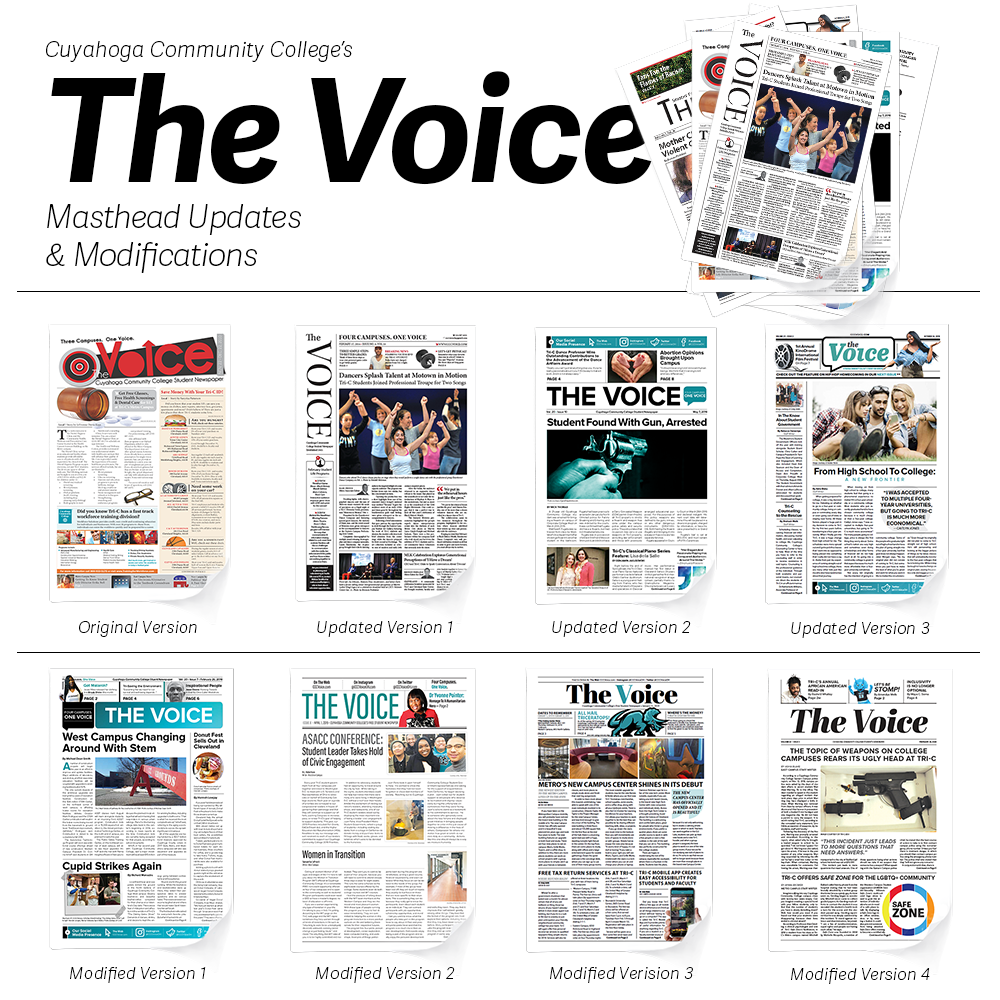
The original version of the masthead, the multiple inset circles, custom font and manipulated rectangle shape was in use in 2010. In 2014, I was given the opportunity to updated it to something more modern.
The 2014 version of the masthead was influenced by a newspaper called The Independent which used a vertical masthead. Using a traditional serif font, it stayed above the fold and was well-received by staff.
The next year the masthead was updated again with a more traditional newspaper style in mind. This version used all caps, a San-serif font with a tri-c blue speech bubble on the right. The college color palette was also used through out the newspaper to help tie in the connection to the college.
The last update to the masthead was a chat bubble with the words The Voice inside in tri-c blue. This update was seen as a bit too literal by some. I ran with it for only a few issues.
There are four modified versions to the masthead which were small tweaks to the updated versions through the semesters. My goal was to keep the name and face of the newspaper fresh and not stagnate like many traditional newspapers.